VIII. Data Cleaning
Alyssa Rosemartin
2025-10-27
Source:vignettes/VIII_data_cleaning.Rmd
VIII_data_cleaning.RmdThis vignette describes four approaches to data cleaning that apply to USA-NPN Observational data: 1. Conflicting Records, 2. Excluding Data Based on Prior No, 3. Multiple First Yeses and 4. Removing Outliers for Individual Plants over Time.
Note that complete information on data structure for USA-NPN Observational data are documented in this report: Observational Data Documentation (https://pubs.usgs.gov/of/2018/1060/ofr20181060.pdf).
1. Conflicting Records
In Status and Intensity Data
As the least processed presentation of the data, this may be the best data type to use for exploring potential data quality issues. The exploration and elimination of status conflicts is readily accomplished in this data type, as described below.
Viewing Status Conflicts
When one or more observers report differing phenophase statuses on the same individual plant or species of animal at a site, all records are flagged with the “Observed_Status_Conflict_Flag”. This is a character field with 3 allowed values: OneObserver-StatusConflict which indicates that the same observer reported conflicting statuses, MultiObserver-StatusConflict which indicates that more than one observer reported conflicting statuses and -9999 which represents the absence of a conflict (null). The following example for 2015-2021 Tuliptree data (Species ID 82) shows how to explore conflicts by site. Options for eliminating records are also given. First the data are downloaded, with the additional field “Observed_Status_Conflict_Flag” included.
df <- npn_download_status_data(
  request_source = 'Your Name Here',
  years = c(2015:2021),
  species_ids = c(82),
  additional_fields = c("Observed_Status_Conflict_Flag"),
)
Next, summarize the number of multiple and single observer status conflicts by site in a new data frame, with the use of the dplyr package. The new column ‘Percent_Conflict’ gives the percent of all records for a given phenophase with a single or multiple observer status conflict.
library(dplyr)
conflict_summary <- df %>%
  count(site_id, observed_status_conflict_flag) %>%
  group_by(site_id) %>%
  mutate(observed_status_conflict_flag=recode(
    observed_status_conflict_flag,'MultiObserver-StatusConflict'='Multi', 'OneObserver-StatusConflict'='One')) %>%
  mutate(Percent_Conflict = n / sum(n))
Next, drop the non-conflicting records, and visualize the percent of each type of conflict, using bar plots in facet wrap by site, in ggplot2.
library(dplyr)
conflicts <- conflict_summary %>%
  filter(observed_status_conflict_flag != '-9999')

library(ggplot2)
p <- ggplot(conflicts,aes(observed_status_conflict_flag, Percent_Conflict)) +
  facet_wrap(~conflicts$site_id) +
  geom_bar(stat = "identity")
plot(p + labs(title = "Percent Multi and One Observer Status Conflict by Phenophase")
     + scale_y_continuous(labels = scales::percent_format(scale = 100)))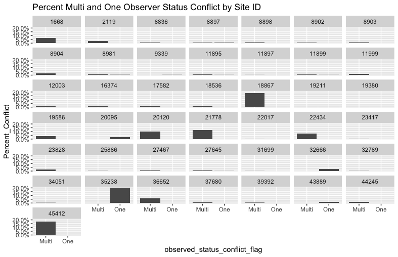
Note that the prior two steps can be repeated, replacing “site_id” with “phenophase_description” to view conflicts by phenophase.
Removing Status Conflicts
Further investigation of these patterns may inform what the user does next. A user may opt to allow yes records to override no records (as done in individual and site phenometrics), to investigate conflicts further or remove all conflicting records.
Some sites where many observers collect data on the same plants (eg, some college classes) have high percentages of conflicting records. To drop all records at sites where more than 5% of the records are in conflict:
df_hi_conflict_sites <- subset(conflicts, Percent_Conflict > 0.05)
df_low_conflict_sites <- subset(df, !site_id %in% hi_conflict_sites$site_id)
To drop ALL conflicting records:
df_no_conflicts <- subset(df, observed_status_conflict_flag == "-9999")In Individual and Site Phenometric Data
The techniques described above can be applied to exploring and removing conflicting records in Individual and Site Phenometrics. Users should bear in mind that in these aggregated data sets, the presence of the conflict flag indicates that conflicting records in the underlying status data exists for at least one of the dates in the series.
2. Excluding Data Based on Prior No
When collecting data, observers report the presence (Yes) or absence (No) of the phenophase on each day. Depending on the application, users may wish to use all phenophase presence data, regardless of whether the observer recently reported a prior absence (No). Alternatively, a user may wish to exclude data without a prior no within a given number of days (7, 14 and 21 days are commonly used cut offs).
In Status and Intensity data this must be done manually (assembling first yes and prior no from the status records; not demonstrated here).
In Individual Phenometrics, data can be readily explored and filtered based on the timing of a prior no, demonstrated below.
In Site Phenometrics, since values for individual plants are averaged, the mean_numdays_since_prior_no field can be used to explore and filter the data. Note that in Site Phenometrics the user can control the first yeses included in the site-level average using ‘num_days_quality_filter = “[insert # days here]”’, as an additional parameter in the data call. By default first yeses without a prior no within 30 days are excluded in this data type.
Note that there is a parallel field reflecting number of days between the last yes (end of the phenophase) and the next no: numdays_until_next_no (in Individual Phenometrics) and mean_numdays_until_next_no (in Site Phenometrics).
To explore and filter data based on prior no in Individual Phenometrics, first download all the flowering dogwood (Species ID 12) for 2021:
df <- npn_download_individual_phenometrics(
  request_source = 'Your Name Here',
  years = c(2021),
  species_ids = c(12)
)
Viewing Data by Prior No
Next, set the -9999 values to NA, and plot a histogram and identify the quantiles of the distribution of the number of days since the prior no, for all the first yes records in this dataset:
library(dplyr)
df <- df %>%
  mutate(numdays_since_prior_no = na_if(numdays_since_prior_no, "-9999"))

hist(df$numdays_since_prior_no,
     breaks = c(0,3,7,14,21,28,35,42,100,250),
     main = "Histogram of Number of Days Since Prior No")

quantile(x = df$numdays_since_prior_no,
         probs = c(0.01, 0.05, 0.25, 0.75, 0.95, 0.99),
         na.rm = TRUE)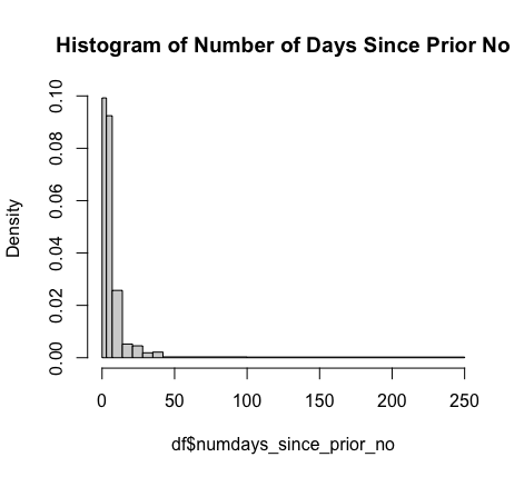
3. Multiple First Yeses
The Multiple First Yes field is only available for Individual Phenometrics.
If the Multiple First Yes flag is set to “1” it indicates that for that individual plant, for that phenophase, for that year, there were multiple instances where the plant transitioned from a status of No to a status of Yes. These can represent real phenomena, for instance a drought deciduous tree that leafs out several times in a year, or a dogwood that reblooms after a frost event. This can also occur when observers are reporting on the same plant on sequential days but are not in agreement on phenophase status with other observers. Note that by design, Site Phenometrics don’t have Multiple First Yeses. For Site Phenometrics, each series represents the average first yes date of all the individuals of the species at the site, for that year, as described in the Observational Data Documentation (https://pubs.usgs.gov/of/2018/1060/ofr20181060.pdf).
A similar approach to the above workflow for status conflicts can be followed in Individual Phenometrics to explore and exclude series with multiple first yeses:
Viewing Multiple First Yeses
First data are downloaded, with the additional field for multiple first yes. Note that the user can also include the optional field “multiple_observers” which indicates whether one or more observers contributed to the series. This field may be useful in determining the cause of multiple fires yeses.
Here we download flowering dogwood data (species ID 12) for 2021.
df <- npn_download_individual_phenometrics(
  request_source = 'Your Name Here',
  years = c(2021),
  species_ids = c(12),
  additional_fields = c("multiple_firsty")
)
Next we can look at the frequency of series with multiple first yeses, by phenophase.
library(dplyr)
mfy_summary <- df %>%
  count(phenophase_description, multiple_firsty) %>%
  group_by(phenophase_description) %>%
  mutate(Percent_MFY = n / sum(n))
Next, exclude rows with no multiple first yeses from the summary, and visualize the percent of multiple first yeses, using bar plots in facet wrap by phenophase, in ggplot2.
library(dplyr)
mfy <- mfy_summary %>%
  filter(mfy_summary$multiple_firsty == 1)

library(ggplot2)
p <- ggplot(mfy,aes(multiple_firsty, Percent_MFY)) +
  facet_wrap(~mfy$phenophase_description) +
  geom_bar(stat = "identity")
plot(p + labs(title = "Frequency of Multiple First Yeses by Phenophase (Flowering Dogwood, 2021)")
     + scale_y_continuous(labels = scales::percent_format(scale = 100)))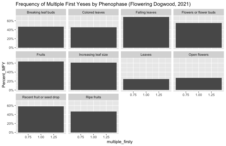
In this example, there is a high frequency of series with multiple first yeses! To examine what is happening in cases like this one, users can look at the multiple_observer field to see how many of the series with multiple first yeses also have multiple observers contributing records. The underlying Status and Intensity data can also provide further detail.
Taking the Mean of Multiple First Yeses
Depending on users’ data explorations and planned uses, it may be appropriate to take the earliest first yes for the phenophase-individual-plant-year combination, or the latest or the mean. Here is how to take the average first yes across all the series for each phenophase-individual-plant combination, for the 2021 dogwood data we downloaded above (be sure to also group by year if using multiple years of data). This is done by grouping by phenophase and individual ID (and year if multi year), and then adding a new column with the mean date of first yes day of year. Then the user should drop the duplicate records based on phenophase and individual ID (and year if multi year). Note that there will still be a multiple first year column in this dataset, but it no longer applies.
4. Removing Outliers for Individual Plants over Time
When observers have looked at the same individual plant over many years, certain records can be excluded based on falling to the extreme of distribution of records (this is the approach used in Rosemartin et al 2015, https://doi.org/10.1038/sdata.2015.38).
First, download 11 years of Red Oak (Species ID 102) Breaking Leaf Bud (Phenophase ID 371) data, in the Individual Phenometrics format:
df <- npn_download_individual_phenometrics(
  request_source = 'Your Name Here',
  years = c(2009:2020),
  species_ids = c(102),
  phenophase_ids = c(371)
)
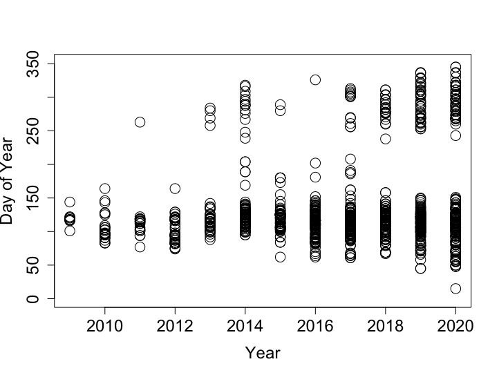
Visualize the unaltered data:
plot(
  df$first_yes_doy~df$first_yes_year,
  ylab=c("Day of Year"), xlab=c("Year"), ylim=c(1,350),
  cex=2,  cex.axis=1.5, cex.lab=1.5, pch=21
)
Remove individual oak trees with less than 8 years of data:
df_8Y <- df %>%
  group_by(df$individual_id) %>%
  filter(n_distinct(first_yes_year) > 7)
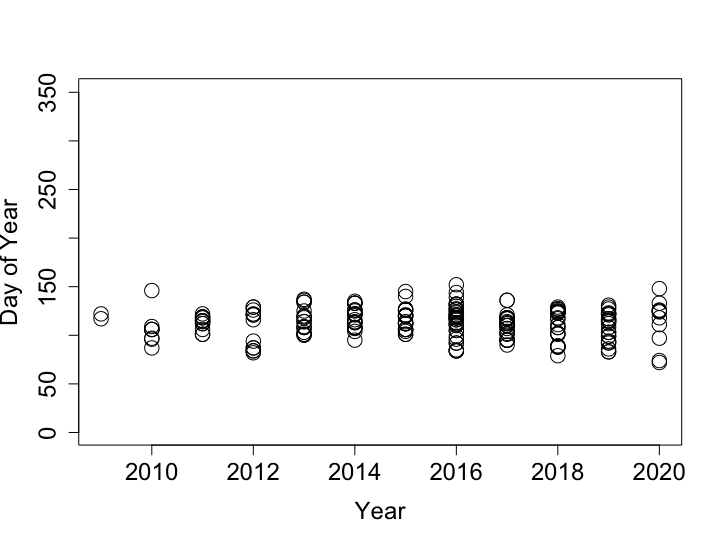
Plotting the data again (as above) can show how reducing the data to individuals with >8 years of records impacts the data set.
Look at the distribution of first yes records for each individual plant over the time period, identify the 25th and 75th quantiles and interquantile range (IQR) of this distribution.
quantiles <- as.data.frame(df_8Y %>%
                        group_by(individual_id) %>%
                        summarize(Q1 = quantile(first_yes_doy, .25),
                                  Q3 = quantile(first_yes_doy, .75),
                                  IQR = IQR(first_yes_doy)))
Create a reference data frame which gives the quantiles and IQR by individual ID
df_8Y_Q = df_8Y %>%
  right_join(quantiles, by = "individual_id")
Remove first yes records that fall outside of 1.5 times the interquartile range for the individual plant.
df_8Y_clean <- subset(
  df_8Y_Q, (df_8Y_Q$first_yes_doy > (Q1 - 1.5*df_8Y_Q$IQR) &
               df_8Y_Q$first_yes_doy < (Q3 + 1.5*df_8Y_Q$IQR))
  )
Visualize the data with the outliers removed.
plot(
  df_8Y_clean$first_yes_doy~df_8Y_clean$first_yes_year,
  ylab=c("Day of Year"), xlab=c("Year"), ylim=c(1,350),
  cex=2,  cex.axis=1.5, cex.lab=1.5, pch=21
)
Huge thanks to Amanda Gallinat and Jeff Oliver for very helpful review of this vignette.